Tag Archive | Process map
How to write great process maps
This is a real example of a process map I found recently as part of a SOP (click on the image to zoom):
 It is a great example of how not to do a process map because it does not follow the most basic rules of mapping. First of all, let’s remember the main purpose of process maps. Yes, you are right, their goal is to describe a process in a clear, visual and unambiguous way. Two notes on this:
- Processes are complex beings that result of the combination of tasks, materials, machines, people, methods and the environment. Not all these components must be part of your map. Many times simplicity is more important than precision (for an accurate description of a process, a SOP or a standard worksheet are typically a better option). However, consider all of them and include everything that can make the map more understandable.
- Maps greatest strength is that they are visual. Most people prefer getting information visually and process maps are one of the best ways to do this. Avoid the massive use of text.
Let’s summarize the key rules for creating great maps:
- Make clear where the process starts and ends: It is so sad to spend minutes looking for the process start point… One good way is to use a rounded rectangle to mark the beginning and the end. (The example map uses a black arrow to mark the start point and nothing to mark the end.)
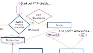
- Represent time correctly: If you write left to right, why don’t you do the same with your maps? Representing time from left to write (or top-down) will make the process more clear. S-shapes, O-shapes or W-shapes may be appropriate sometimes, but in most cases they will make the map difficult to understand. (The example map uses an O-shape most of the time and a Y-shape at the end. There is no need to do that. Additionally, there is no clear evidence of how time goes by)
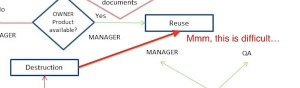
- Represent tasks and precedences correctly: The task order must be consistent and, of course, possible. (The example map proposes to “reuse” the product after its “destruction”. This is obviously impossible)
- Be consistent:
- Use always the same symbols for the same things. (The example represents tasks using 4 different ways: blue boxes, blue diamonds, pink diamonds and plain text)
- Represent the same type of information in the same way (The example uses plain text for: tasks, task owner (MANAGER) and locations (WAREHOUSE),…)
- Use always the same symbols for the same things. (The example represents tasks using 4 different ways: blue boxes, blue diamonds, pink diamonds and plain text)
- Colors must mean something: Few things are more misleading than the random use of colors. If you use different colors, make sure they mean something relevant (The example uses red and green arrows, but they mean the same, I think)
- Use standard symbols: There are several symbols widely accepted. A box means a task, a diamond means a decision, a circle is the start/end point, red means bad, greed means good… If you choose not to follow them, at least be consistent (rule #3) and show the meaning of each symbol. (The example uses a black arrow to indicate the start point and diamond boxes for tasks, which are not a standard symbols. If you want to do so, explain the new meaning of the symbols somewhere)
- Map one thing at a time: You don’t have to put everything (every piece of data, every process) on your map. Remember that a confusing map is a useless map. Sometimes it makes sense to draw several processes together, but consider separating them to improve clarity. (The example maps several processes: product availability, product manufacturing, product reevaluation and product destruction. It makes sense to mix those processes because the map is very high level; however it would be beneficial to visually separate them or to create different maps for each process and increase the level of detail)


Good maps make training quicker and more effective. This results in fewer errors and higher execution speed. They are worth the effort.
Recommended links:
- Guide to creating process maps: http://www.isixsigma.com/tools-templates/process-mapping/practical-guide-creating-better-looking-process-maps/
- Symbols reference:
